Making Of: Vejigante Mask of the Blue Blur
With the arrival of Sonic Frontiers, I met with a difficult decision: To buy or not to buy? That was the question. One the one hand, it was a Sonic game, and me being fan of the blue blur since the 90’s, it seemed like a no-brainer. On the other hand, however, it was a Sonic game, and that came with terrible implications that challenged my desires… since 2006. Thus, I did what every responsible adult does… I used my “artistic process” to justify the purchase.
Was I inspired before to draw the fastest thing alive? Yes. Was I going to illustrate Sonic the Hedgehog regardless? No idea. I knew I wanted to make an artwork based on Sonic, but never felt the motivation to do so. You can blame stress from work (my actual 9-5), homesickness, and all pesky things that make life unbearable. I don’t regret it, though. As soon as I started working on the art, I purchased the game for a deep dive into the world of Sonic the Hedgehog. It was the right call for me.
THE PROCESS
The greatest issue I had with Sonic was the anatomy. While artistic freedom was taken in the design of the character, it still followed universal rules that worked and made sense. For me, the difficulty was evident in the lack of hips. Connecting the legs directly to the bean-like torso works perfectly with specific poses, particularly standing. But I didn’t want to draw Sonic standing, where’s the point in that?
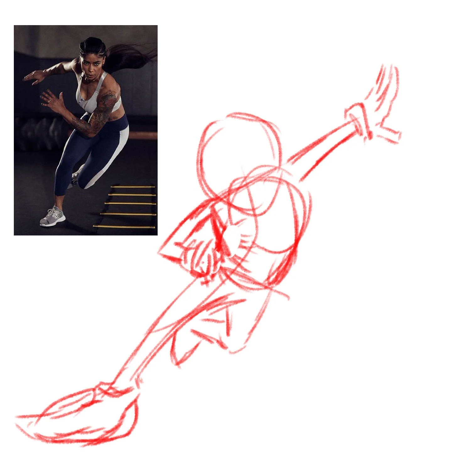
I used several reference photos for the pose, being loose with the anatomy so as to give myself the freedom to keep progressing. In matters of style, I wasn’t concerned with which sonic I was drawing (classic, adventure, xd, etc.). I just chose the shape that I liked best and went on from that. I wanted to portray movement and speed in the illustration (it’s sonic after all), but I didn’t want to illustrate him running. Why? Well, it’s done and obvious, and also, depicting high speed in a character comes with the inclusion of blur and stretch. I didn’t want to distort the character. So I went for a pose that showed Sonic in the process of breaking from a run. The gesture and search for balance shows that he is still in fast motion.
It wouldn’t be true to my nature if I didn’t “vejigantize” our beloved hedgehog. I chose the vejigante mask design of Loíza, a town in my homeland, because it mirrors Sonic’s fun and carefree attitude. Like most of my Vejigantismo characters, the mask retains the original palette while the character is transformed. In this case, Sonic has lost his distinguishable blue fur, and there’s a feedback loop of power coming and going from the mask, as can be seen by the markings coursing in his head. The blue shoes were an aesthetic choice.
FINAL THOUGHTS
Starting this project, as with many others, was a drag. Once I got into the anatomy of Sonic, I got my rhythm and got moving. This piece (together with my Super Sonic piece) took me a total of 6 hours and $41 (for the game). Playing on my breaks also helped me get more acquainted with the character, although I don’t recommend spending money every time you need a reference. In the end, the result was an energized hedgehog, just like the one I love.
Like this article? Please consider sharing and commenting so I can reach more people. If you have a character you’d like me to work on, let me know!


